
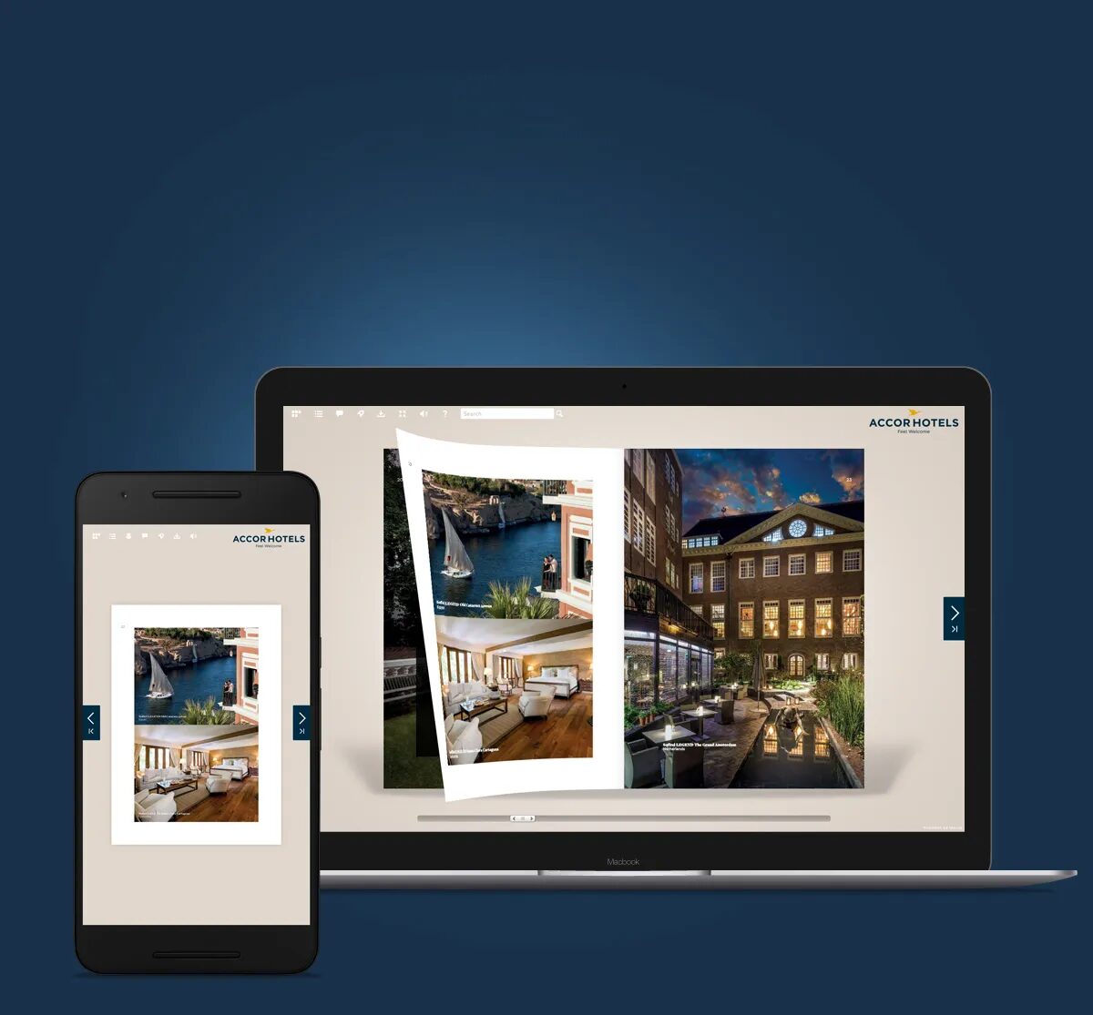
Naming, logo, application development, user interface, website. Fluidbook is a SaaS product designed and developed in-house by Cubedesigners since 2007. Global premium reference for interactive catalogs, more than 1,800 customers.
Since the early 2000s, with the explosion of digital uses, the question has been asked in many companies and communication agencies: what to do with paper brochures and catalogues? The obvious (because simpler) answer at the time was the PDF. The ambitious answer was to create a real interactive consultation experience, fast, pleasant, adaptable to all screens.
We chose the second option. And rather than waiting for a customer to ask us for this product, we designed, developed and launched it ourselves. Fluidbook thus became the first SaaS product of Cubedesigners, and one of the projects that best illustrates our ability to carry out a project from start to finish.
Naming: a word that says it all
We created the name Fluidbook, a contraction of "fluid" for loading speed and fluidity of consultation, and "book" which immediately links the product to the publishing sector. A name that works in French and English, short, memorable.
The logic is the same as for Enko ou d’autres Naming projects que nous menons pour des clients : le nom est une décision stratégique qui conditionne la perception du produit avant même que l’utilisateur l’ait testé.
Logo and identity
The logotype reprend une typographie bas de casse qui rappelle l’imprimerie, associée à un symbole de feuilles qui évoque le feuilleteur. Simple, reconnaissable, et cohérent avec la proposition du produit : la publication papier rendue fluide et interactive.

The interface: the publication in the center, the interface in the background
The main constraint of the Fluidbook UX was clear: the interface must never take precedence over the publication itself. The user comes to read a catalog or a brochure, not to use software.
We've designed an interface that's free of the nods, with intuitive navigation, discreet controls, and a display that's optimized for all screen sizes: desktop, tablet, mobile, portrait or landscape mode, in 4:3, 16:9, or 16:10 ratios.
A major element: each Fluidbook is personalized with the customer's colors. The interface is not a fixed template applied to everyone, it adapts to the graphic charter of the publishing company. This required designing a flexible graphic theme generator, capable of managing very different identities without losing readability.

Features: beyond the simple flipper
Where most competing solutions were limited to reproducing the metaphor of the leafing machine, Fluidbook has integrated features from the outset that really enrich the experience: animations, embedded videos, slideshows, quizzes, e-commerce features, etc.
The website and the presentation video
The Fluidbook website a été conçu comme un outil de vente autonome, capable de répondre à la plupart des questions d’un prospect en avant-vente sans intervention commerciale. Ergonomie, rédaction des contenus, webdesign et développement responsive : réalisé intégralement en interne.
The presentation video, designed in the same way, allows you to understand the product in two minutes. Storyboard, design, bilingual texts, realization.
More than 2000 customers, a premium reference in the sector
Since 2007, Fluidbook has established itself as the high-end reference for interactive catalogues. More than 2000 customers, from small associations to international groups, have chosen it for the quality of the rendering and the reliability of the service.
